Finnovó
Role
Team Lead &
UI/UX Designer
App
Finnovo
Category
Fintech App
Duration
1 month
Year
2025
Project Type
Internship Project
Team Size
4 members
Platform
Mobile-first, responsive web
Finnovó
A Gen-Z Focused FinTech App for Smart Money Management
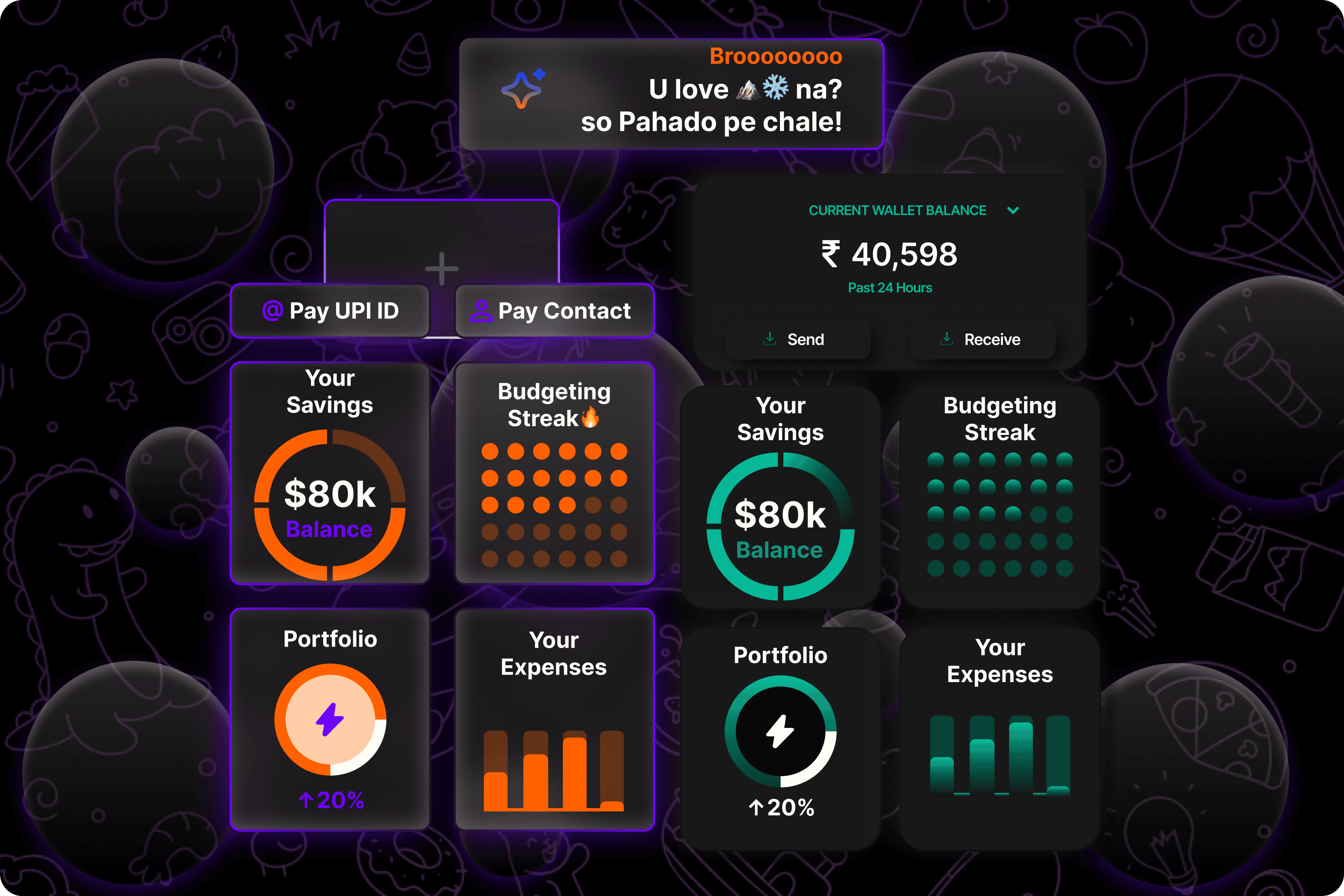
Finnovó is a mobile-first personal finance app designed specifically for Gen Z college students who struggle with tracking spending, saving consistently & building healthy financial habits. It combines budgeting, planning, expenditure tracking, savings insights & Al-powered insights-all through a sleek, intuitive interface!

Designed in a Sprint. Built for Real Gen Z Problems.
Finnovó is a concept-driven FinTech app designed during a 4-week UI/UX design sprint, focusing on Gen Z students navigating impulsive spending & inconsistent income. The challenge involved turning raw research into a visually smart, user-first finance experience.

Problem Statement
Why Gen Z Needs a New Kind of Finance App
Young college students often face challenges managing their pocket money or freelance earnings. Most existing finance tools feel overwhelming or outdated to them. They need a simplified, intuitive platform that helps them track, save & plan better—without needing a financial background.

The Solution
A Finance App That Thinks YoungFinnovó is a sleek, Gen Z-focused finance app that simplifies budgeting, savings & expense tracking through customizable categories, visual progress bars & AI-powered tips. Built with minimalism in mind, it delivers a motivational yet effortless experience—wrapped in a modern interface that feels both smart & familiar
Project Goals:
"Designing for Empowerment and Simplicity" Our primary goal was to offer users a tool that makes money management less intimidating & more empowering. Instead of overwhelming them with numbers, we focused on gamified visuals, digestible insights & tone that resonates with their lifestyle. Accessibility and seamless UX were woven into every element of the interface.
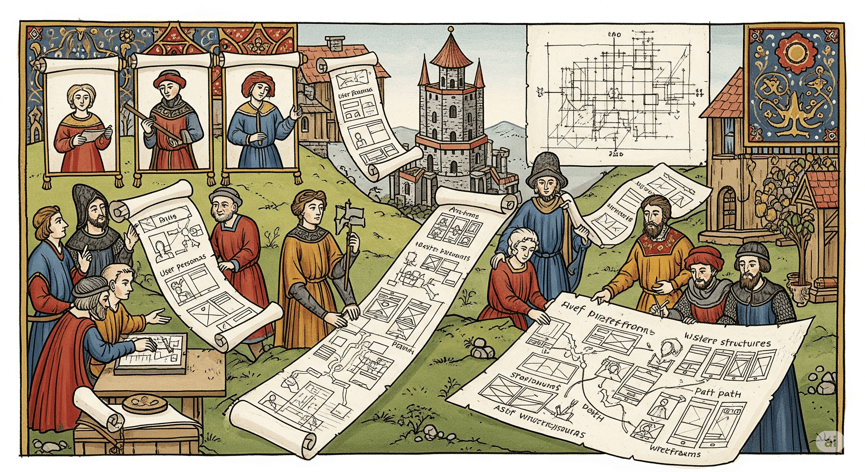
The journey of the Great Finnovó
"Turning Research Into Relatability" We began by identifying real users & crafting personas that reflected modern Gen Z finance behaviors. From mood boards & user journeys to wireframes, every decision was grounded in empathy. With rapid collaboration, feedback loops & late-night meetings, we moved from broad ideas to a refined, user-first solution.
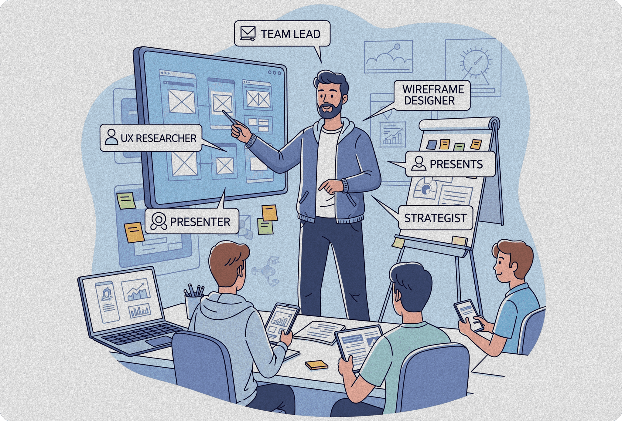
“Designing & Directing”
My Role
Timeline
Divide across 4 weeks
1
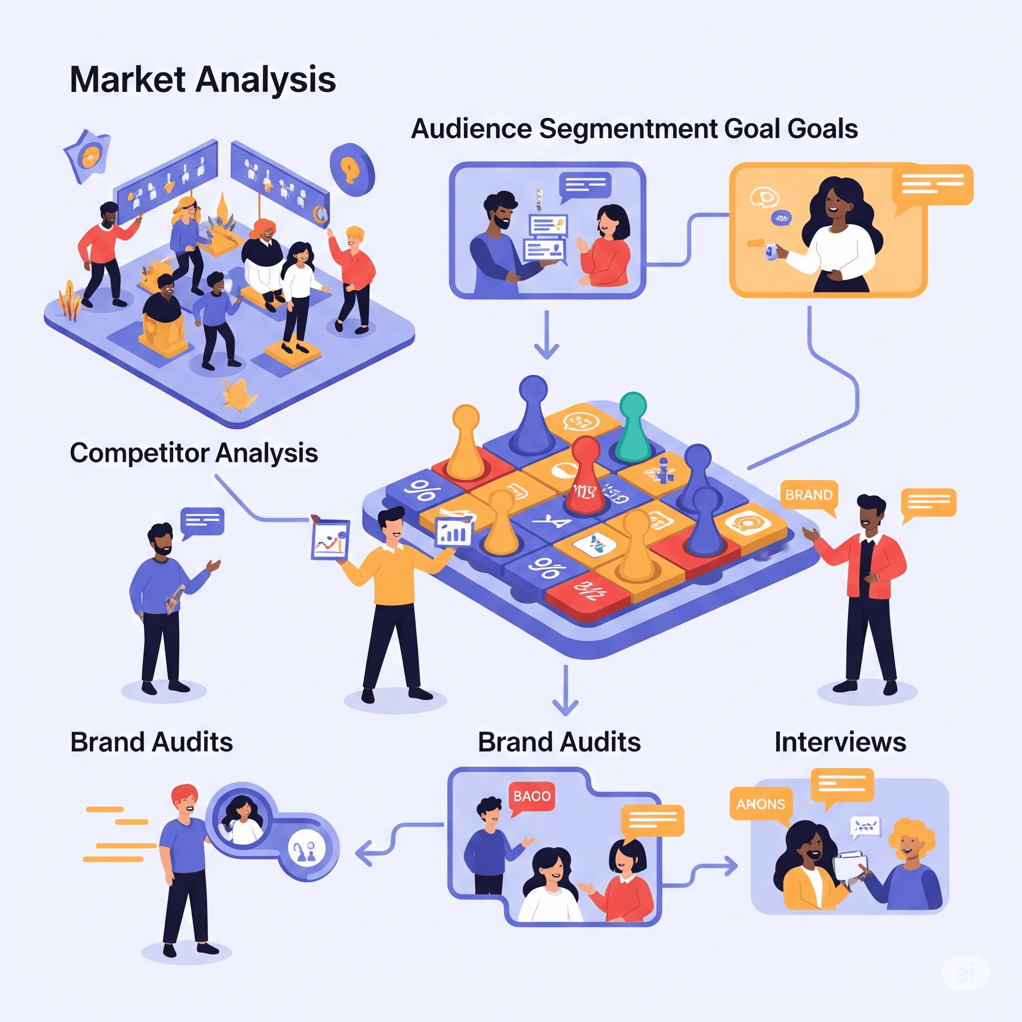
Empathize & Reflect
We start by understanding your market, audience, and goals. This includes competitor analysis, brand audits, and interviews to get a full picture of where you stand and what needs to change.
2
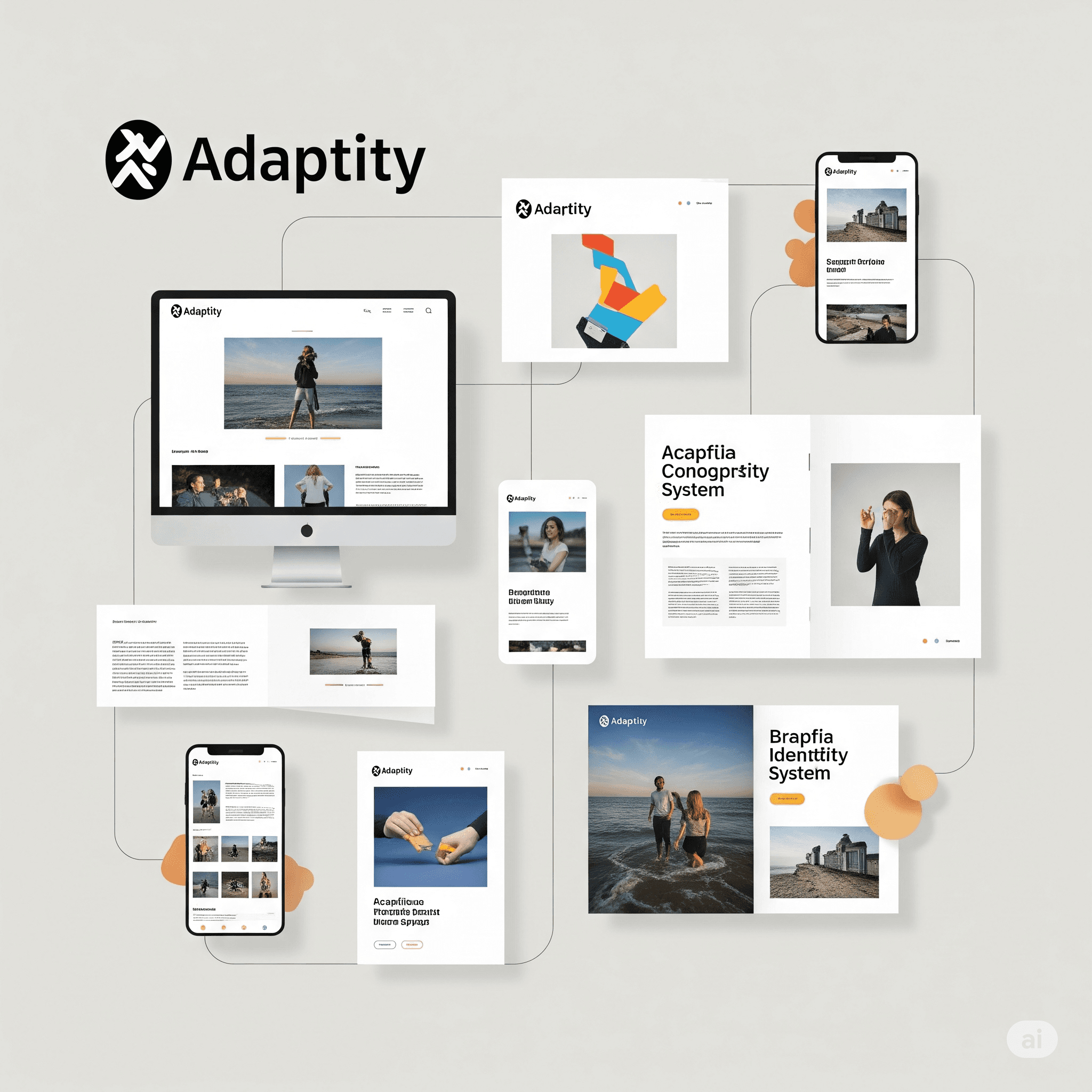
Ideate & Sketch
We bring the strategy to life through a full visual identity system. That includes logo, typography, color, imagery, and layout rules — applied across key touchpoints like web, print, and social.
3
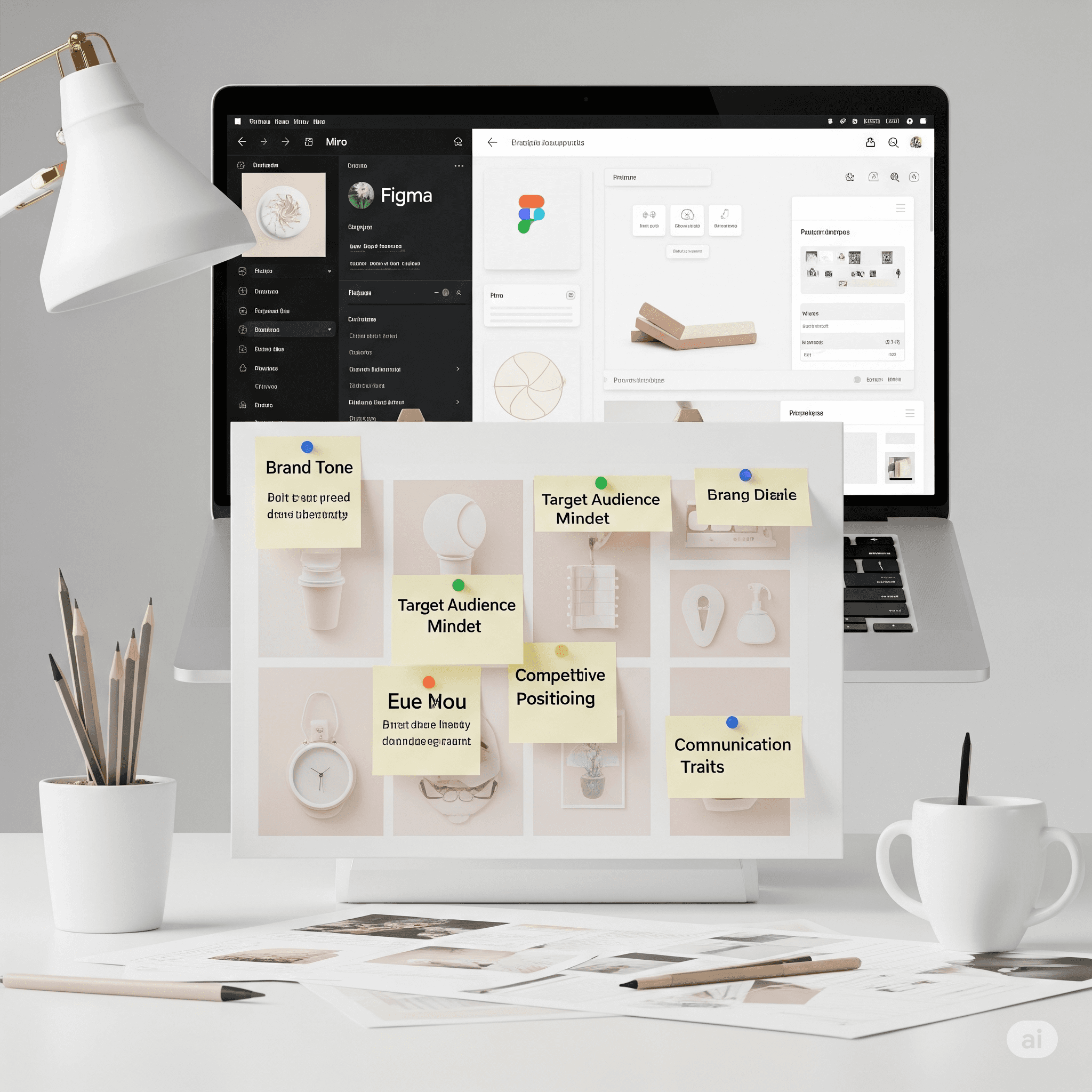
Present & Reflect
We define the core of your brand — positioning, messaging, and tone of voice. This becomes the foundation for how your brand behaves and communicates, both visually and verbally.
4
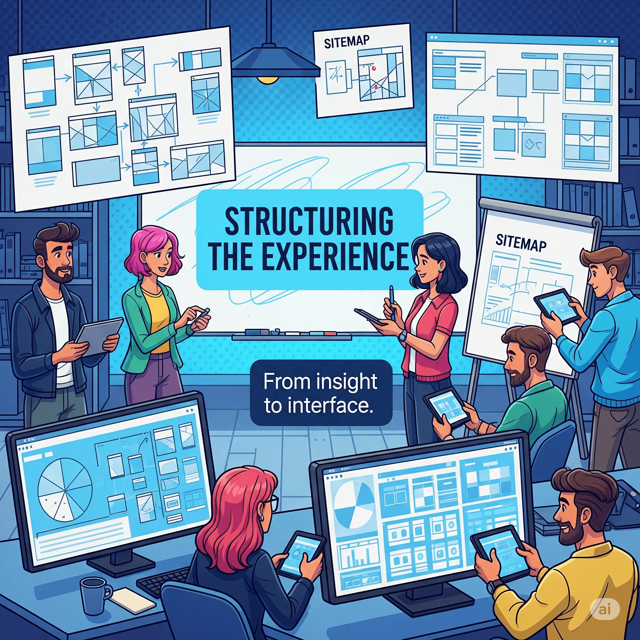
Design
We bring the strategy to life through a full visual identity system. That includes logo, typography, color, imagery, and layout rules — applied across key touchpoints like web, print, and social.
Tools

Framer

Figma

Photoshop

Illustrator

Sketch

Midjourney

Spline

Blender

User Persona
👱🏻♀️01

aLEX,
fREELANCER, 20
“AhHhH.........I already’ve wasted so much money,I need to start saving & start investing”

Alex, Student, 20
Name:
Age:
Program:
Education:
Profession:
Location:
Lifestyle:
Alexandra Casanta
20
BFA in New Media Design (Freshman)
Rochester Institute of Technology (RIT)
Freelancer (part-time)
New York
Gen Z, socially active, part-time freelancer

Personality
Easily influenced by peers
Impulsive spender
Budget-conscious (aspiring)
Ambitious
Tech-savvy
Independent-minded
Multitasker
Aesthetic-driven

Hobbies & Interests
Curating Spotify playlists
Video Editing
Digital Arts/ Design
Online Shopping
Journaling & Self-Reflection
Multitasker
Reading & Learning abt Finance
Creating Instagram Reels

Pain Points
Struggles with impulse spending & budget control
Lacks clear visibility of where her money goes
Feels guilty after overspending, especially on non-essentials
Finds traditional finance tools complex & unrelatable

Goals
Track her expenses easily without it feeling like a chore.
Lacks clear visibility of where her money goes
Save up for meaningful goals (like a trip or investing).
Build healthy financial habits as she grows into adulthood.

BIO
Alexandra is a 20-year-old freshman at RIT in New York. While she receives a small allowance from her parents, she feels uncomfortable depending on them financially as she steps into adulthood. To gain independence, Alex has taken up freelancing as a side gig — editing videos & designing posts for small brands.

Her Story
Alexandra is currently pursuing a Bachelor of Fine Arts in New Media Design at RIT, blending her passion for visual design with her growing interest in user-centered technology. As a creative freelancer, she designs social media content & edits videos for small businesses — giving her early exposure to real-world money management struggles.
Empathy Map
Says

“I want to stop asking my parents for money.”
“I’m trying to save up for a trip, but I keep overspending.”
“I don’t know where all my money goes every month.”
“I’ve started freelancing, but managing my earnings is so confusing.”
Thinks
“I wish I was better at budgeting.”
“Finance apps look boring or intimidating.”
“I should probably invest… but I don’t know where to start.”
“My friends never track their money — am I overthinking this?”
Hears/Feels
Feels Guilty after overspending
Excited when she saves even a small amount
“Let’s go out this weekend!”
“Budgeting is boring, no one really follows it.”
Sees
Friends spending freely on parties, food, fashion
Complex finance dashboards in apps like PayTM or traditional banks
Budget tracker spreadsheets, intimidating financial jargon
Trendy finance influencers on TikTok & Instagram
Does
Spends on impulse — especially during social plans
Takes up freelance gigs to earn extra income
Tracks expenses manually (sometimes) or using notes app
Scrolls through shopping apps or Instagram storefronts late at night
Gains
Wants to become financially independent
Get AI-based nudges to help her stay on track
Simple, visual financial insights without feeling judged
Long-term: start investing confidently in small steps
Competitor Analysis
Competitor Analysis
Top Rivalry ~ Fampay
Aspects ~
Target Age group
Onboarding
Budgeting Tools
Investment Plan
Design Approach
AI-Based Nudges
Tone & UX
Finovo
18–24 (college students)
Simple sign-up with optional financial goals
Gen Z, relatable, goal-driven
Yes – category budgets + nudges
Yes (starter level)
Personalized dashboards, visual savings
Yes
Fampay
11–18 (teens, minors)
KYC with parental consent
Teen-focused, gamified
Limited – focused on spending
No
Card-focused, gamified UI
No
Swot Analysis


From Chaos to Clarity
Our team explored several angles: how Gen Z spends, where they fail to track expenses & what visual styles resonate most. After dissecting competitors & aligning goals, we settled on a feature set that felt powerful yet approachable. The brainstorming phase helped us define the app’s tone, structure & user flow.
Brainstorm & Ideations

Design underwent many Iteration
I then tranformed my ideation brainstorming, pen & paper wireframes into much professional looking Low fidelity wireframes
Low Fidelity Wireframes
Iteration & Feedback
How Feedback Shaped Function
Throughout weekly reviews, we incorporated feedback into multiple rounds of iteration. From simplifying navigation to adjusting colors & tone for clarity, each revision made the product more aligned with user expectations.
"Quora has completely transformed how I live day-to-day. I can control my lights, thermostat, and even my coffee maker from my phone — it’s like living in the future! Everything just works seamlessly."

Jessica L
Verified buyer
"What impressed me most about Quora is the reliability. The setup was super easy, and the app is intuitive. I feel safer and more connected to my home, even when I’m traveling."

Daniel M
Verified buyer
"I’ve tried a few smart home brands, but Quora stands out. The design is sleek, the performance is flawless, and their customer support is outstanding. Highly recommend to anyone starting their smart home journey!"

Priya S
Verified buyer
"We upgraded our entire home with Quora devices, and it’s been the best decision. Voice commands, automation, security — it all works together beautifully. Plus, it’s actually affordable!"

Marcus T
Verified buyer
but why...
Finnovó is unique?🤔
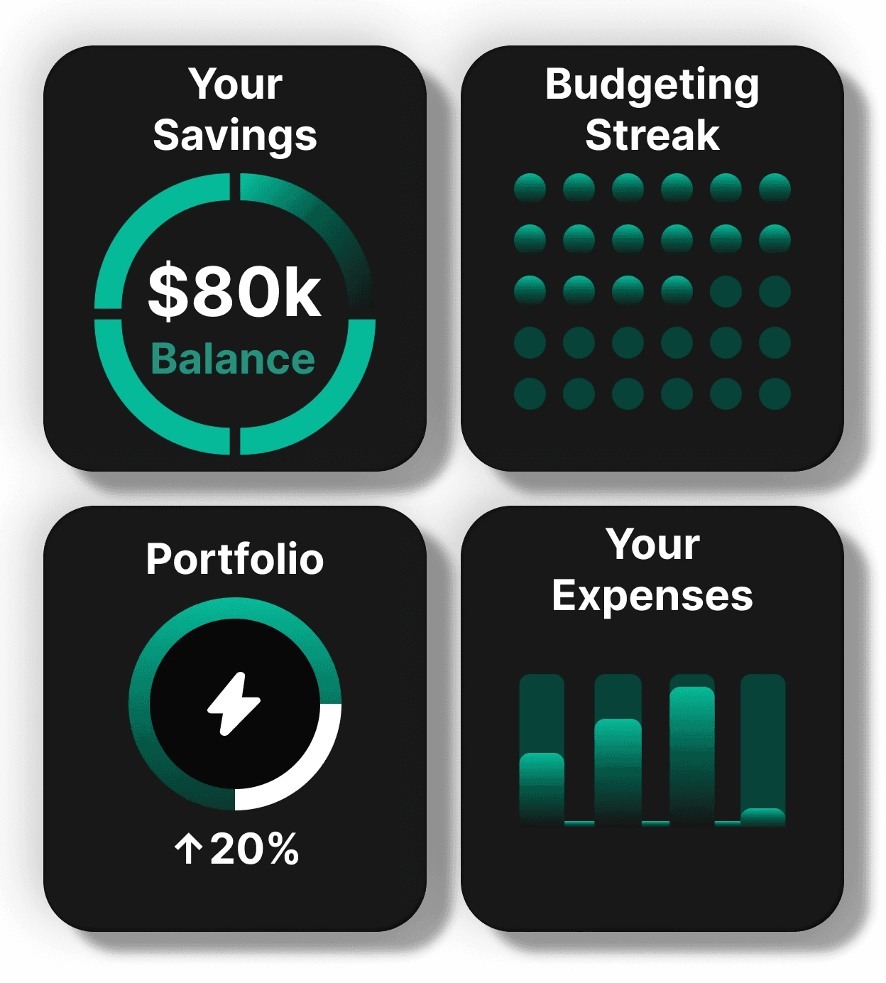
Smart Trackers
Finnovó empowers users to monitor all key financial habits with ease—covering savings, budgets, daily expenses & even small-scale investments. All four trackers are visually gamified, minimalist & built for quick check-ins, not financial jargon.
GenIndic – Your AI Money Buddy
At the heart of Finnovó lies GenIndic, an AI-powered financial assistant that sends smart nudges like: “You’ve spent ₹800 today — you need to save ₹500 more this month to stay on track!”
It analyzes patterns &helps users build healthier habits with contextual, bite-sized insights—something no spreadsheet ever could.

Final UIs
Hear every detail
Quora ProAudio
Dome ProAudio brings powerful bass and crisp highs for a truly immersive experience. Precision-tuned for audiophiles who demand more.
Available in light blue.
Hear every detail
Quora ProAudio
Dome ProAudio brings powerful bass and crisp highs for a truly immersive experience. Precision-tuned for audiophiles who demand more.
Available in light blue.


Check out the Interactive prototype dudeeee!!!
I assure you, it's amazinggg! :)
Prototype

Design System
Color Palette


Primary Palette
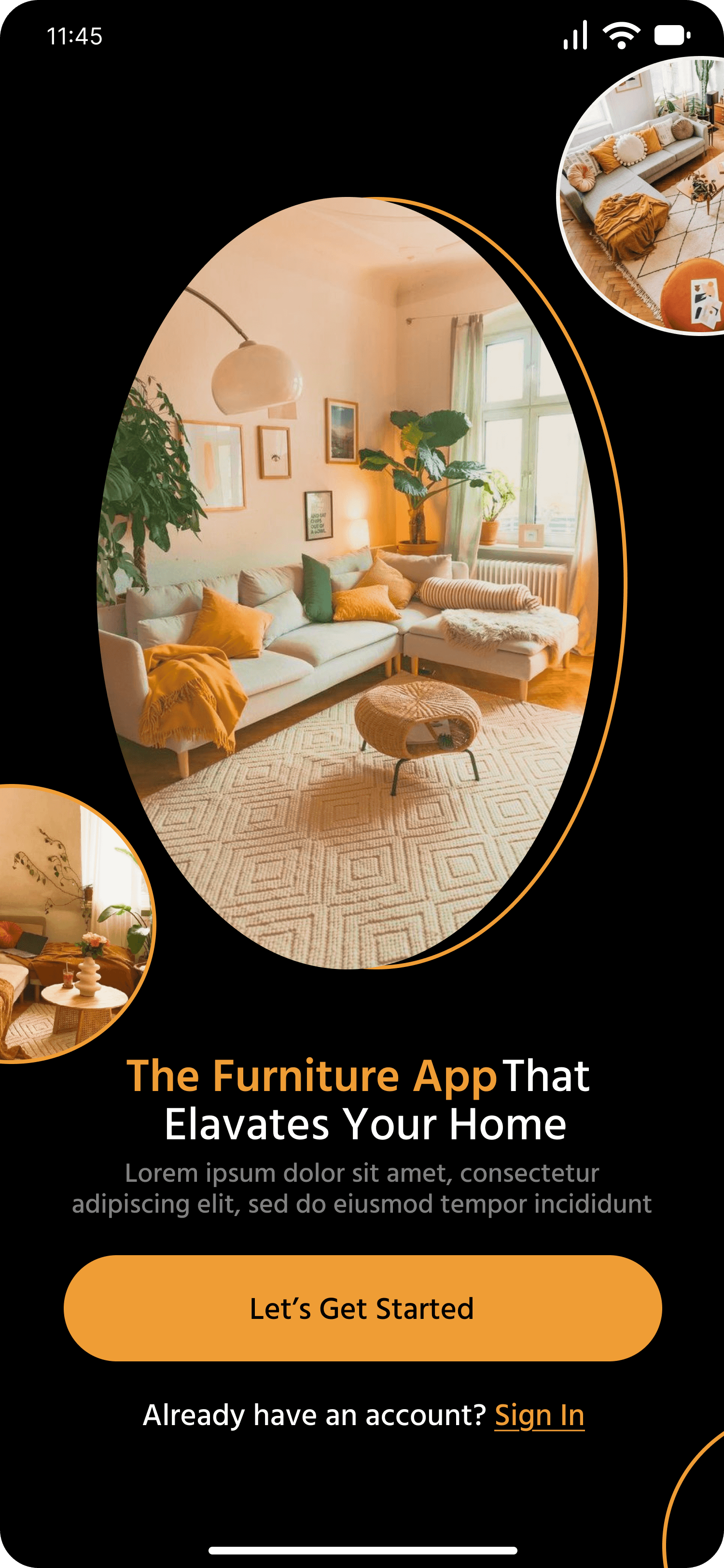
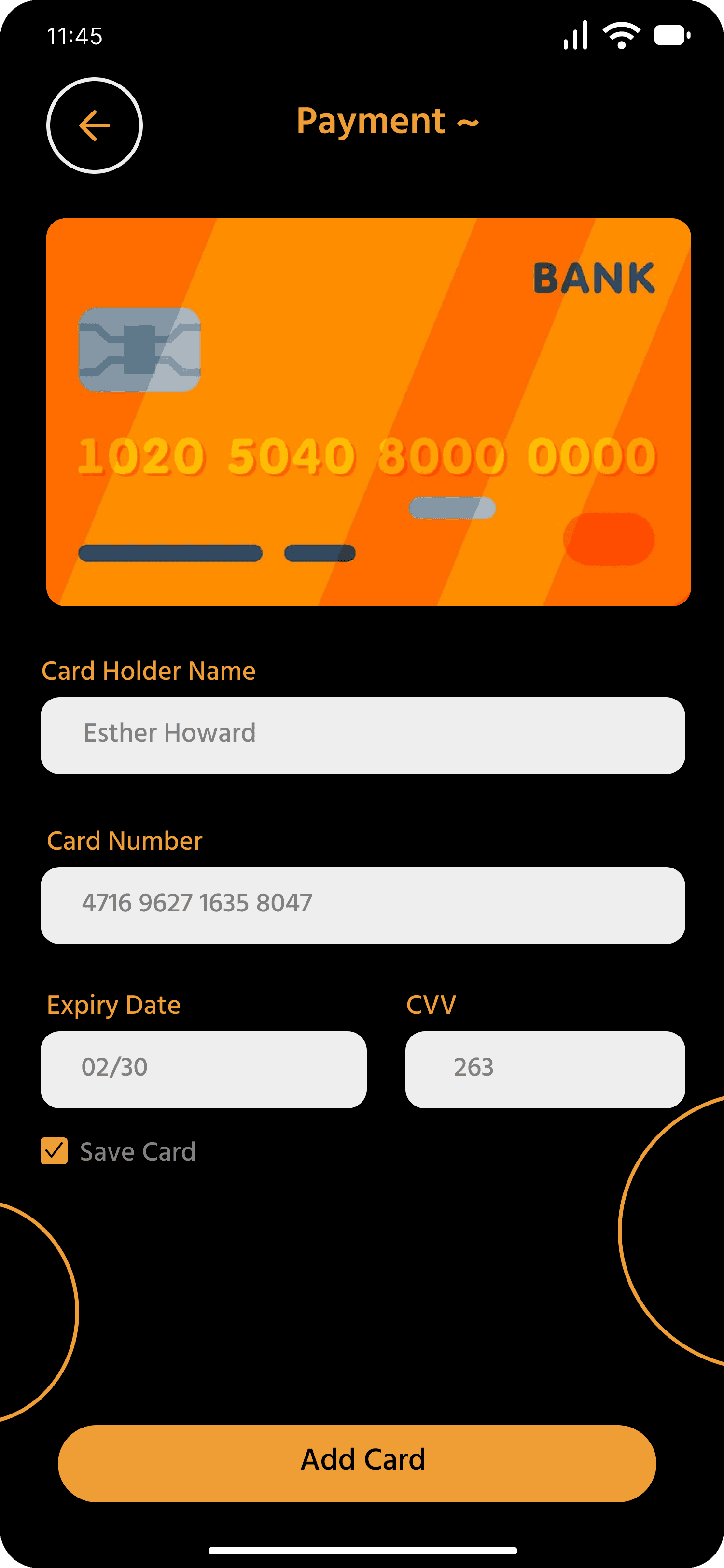
FurniEase uses a grounded, warm palette to strike a balance between function, aesthetic clarity & emotional trust—essential for an e-commerce furniture experience.
Orange | #FF8800
Used for buttons, icons, highlights & star ratings. This bold shade creates strong visual hierarchy and action cues. It adds warmth, draws attention to CTAs & reinforces brand identity.
Black | #000000
Used for body background and typography. Creates maximum contrast and focuses attention on core UI elements. Its neutrality pairs well with warm accent colors.

Secondary Palette
The neutrals offer calm, breathable contrast to the dominant orange, allowing content and visuals to shine without clutter. Together, this dual-tone system builds hierarchy, usability & an inviting atmosphere, making browsing & purchasing smoother.
Cream | #FFFBF0
A soft background tone used in input fields & subtle card elements. Helps reduce eye strain on dark mode & brings a premium, earthy tone to the app interface.
Grey | #808080
Used sparingly for secondary labels, disabled buttons, and less important text. This neutral tone communicates subtlety and downplays non-critical UI elements, maintaining focus on primary actions.
White | #FFFFFF
Primarily used for text on dark backgrounds, card highlights, and iconography. It acts as the main contrast agent, enhancing legibility and drawing attention to content in a dark UI.

Typography
Icongography

Outline

Bold

Reflections & Learnings
Not every idea made it to the final product
From Research to Realization
What’s Next for Finnovó
—and that’s okay.
Still Room to Grow
Balancing Vision with Execution
Challenges Faced:
Designing for Gen Z meant walking a fine line between playful & functional. Our biggest challenge was to avoid feature creep while keeping the app engaging. The biggest win? Building something that felt native to a student’s lifestyle.
Key Achievements:
The project was praised for its clean storytelling & attention to detail. The AI-powered welcome feature & visual budgeting flow stood out as highlights. User testing validated our decisions & the app’s tone & aesthetics were especially appreciated for feeling relatable & fresh.
Reflections:
This project reinforced the importance of empathy-first UX, showing how user-centered insights lead to stronger product decisions. We also experienced the benefits of maintaining a consistent design system to streamline team collaboration.
Most of all, we learned that storytelling in design creates more impact than overloading features.Most of all, we learned that storytelling in design creates more impact than overloading features.
Scope of Improvements:
There’s room to evolve Finnovó further by introducing a forecasting tool to help users plan ahead. Adding language options would enhance accessibility, while gamified savings features—like streaks or rewards—could boost engagement!
Future versions could benefit from more real-time usability testing, especially with users outside the design space. Expanding the AI’s contextual intelligence & building a guided onboarding flow with bite-sized money tips would also improve the user journey.
Conclusions:
A Finance App Gen Z Can Actually Use We created an experience that feels familiar, stylish & practical—blending usability with the aspirational tone Gen Z craves. More than a finance app, Finnovó became a guide for daily money mindfulness.
Your feedback helps me grow.
I’m always open to new perspectives. Got thoughts on this case study? Feel free to connect—I’d love to hear how it could be improved & how can i grow as a designer!
Got any Suggestions?

Dhanyawad
ッ
Overview
Proven by People, Designed to Perform
Backed by a global community of users, our speakers combine cutting-edge tech with sleek design—made to stand out