Jump to~

FurniEase
Role
UI/UX Designer
UI/UX Designer
Duration
1 month
1 month
Category
Ecommerce App
Ecommerce App
Year
2025
2025
App
Furniease
Furniease
FurniEase
FurniEase
A seamless furniture shopping experience, built with clarity, trust, and warmth in mind.

Introduction
Introduction
FurniEase is a mobile-first platform designed to simplify the often frustrating experience of buying furniture online. Rooted in empathy and intentional design, this case study walks through my end-to-end process—from uncovering problems to crafting a polished, user-friendly prototype.
FurniEase is a mobile-first platform designed to simplify the often frustrating experience of buying furniture online. Rooted in empathy and intentional design, this case study walks through my end-to-end process—from uncovering problems to crafting a polished, user-friendly prototype.
This wasn’t just a UI challenge—it was about solving real problems for real people.
This wasn’t just a UI challenge—it was about solving real problems for real people.


Designing a mobile experience that brings warmth, ease, and trust to buying furniture online. This case study explores the full design process, from identifying user pain points and crafting design solutions to developing a high-fidelity interactive prototype.
Designing a mobile experience that brings warmth, ease, and trust to buying furniture online. This case study explores the full design process, from identifying user pain points and crafting design solutions to developing a high-fidelity interactive prototype.
Context
Context

Problem Statement
Problem Statement
Buying furniture online is often a clunky and uncertain experience. Users struggle with overwhelming product options, lack of trust in visuals, and unclear navigation. There’s a clear gap in the market for a more human-centered, streamlined approach.
Buying furniture online is often a clunky and uncertain experience. Users struggle with overwhelming product options, lack of trust in visuals, and unclear navigation. There’s a clear gap in the market for a more human-centered, streamlined approach.


Buying furniture online is often a clunky and uncertain experience. Users struggle with overwhelming product options, lack of trust in visuals, and unclear navigation. There’s a clear gap in the market for a more human-centered, streamlined approach.
Buying furniture online is often a clunky and uncertain experience. Users struggle with overwhelming product options, lack of trust in visuals, and unclear navigation. There’s a clear gap in the market for a more human-centered, streamlined approach.
The Solution
The Solution


How We Reached There: The Journey of FurniEase
How We Reached There: The Journey of FurniEase
FurniEase began with a simple question: Why is renting furniture still so complicated? Through user interviews & competitor analysis, I uncovered key pain points—confusing interfaces, rigid plans & lack of trust. This project was rooted in empathy, driven by research, and shaped by the everyday struggles of young, mobile users.
FurniEase began with a simple question: Why is renting furniture still so complicated? Through user interviews & competitor analysis, I uncovered key pain points—confusing interfaces, rigid plans & lack of trust. This project was rooted in empathy, driven by research, and shaped by the everyday struggles of young, mobile users.

“Designing Ease isn’t just about removing EFFORT —it’s about reducing Friction
“Designing Ease isn’t just about removing EFFORT —it’s about reducing Friction
Project Goal
Project Goal
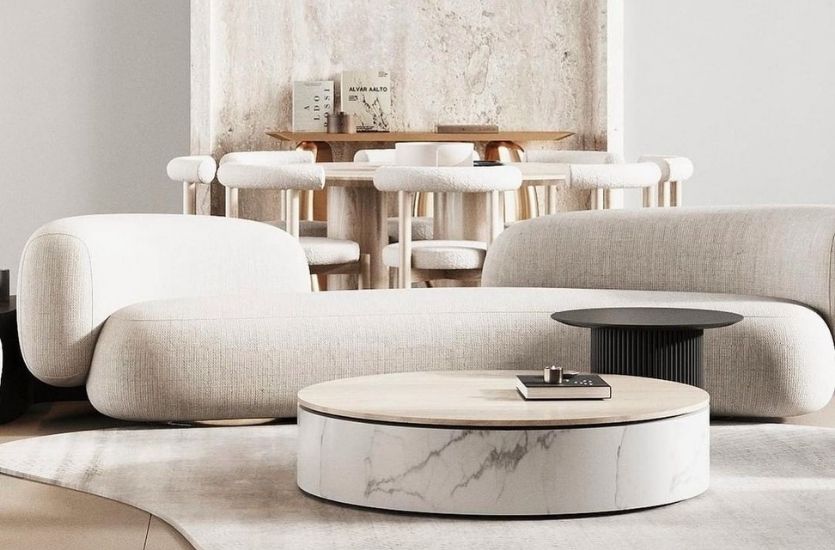
Create a mobile-first furniture app that allows users to browse comfortably, trust what they see, preview items in their space, and complete their purchase with confidence.
Create a mobile-first furniture app that allows users to browse comfortably, trust what they see, preview items in their space, and complete their purchase with confidence.
All while maintaining an aesthetic and calm UI.
All while maintaining an aesthetic and calm UI.


User Persona
User Persona
👱🏻♀️01
👱🏻♀️01


Alex, Architect, 28
“I need to quickly check measurements & see how furniture would look in my client’s house & I care a lot about design.”
Name :
Alexandra
Age :
28
Job :
Architect
Education :
Indian University of Arts & Design
Location :
Bengaluru
Hobbies :
Interior styling, art galleries, & Pinterest scrolling
Alex, Architect, 28
“I need to quickly check measurements & see how furniture would look in my client’s house & I care a lot about design.”
Name :
Alexandra
Age :
28
Job :
Architect
Education :
Indian University of Arts & Design
Location :
Bengaluru
Hobbies :
Interior styling, art galleries, & Pinterest scrolling

Bio
Riya is a young architect working with a modern design firm, often visiting clients’ homes to plan and visualize interior spaces. Her work requires precision, quick access to measurements & a knack for recommending furniture that fits aesthetically. She values tools that are efficient and visually polished.
Bio
Riya is a young architect working with a modern design firm, often visiting clients’ homes to plan and visualize interior spaces. Her work requires precision, quick access to measurements & a knack for recommending furniture that fits aesthetically. She values tools that are efficient and visually polished.

Personality
— Detailed Oriented
— Creative
— Fast-Paced
— Tech Savyy
Personality
— Detailed Oriented
— Creative
— Fast-Paced
— Tech Savyy
Pain Points
— Struggles with visualizing furniture in
real-time during client visits.
— Has to switch between multiple apps for measurements, design, and inventory.
— Current rental platforms lack style filters & aesthetics.
— Furniture dimensions are often buried in product descriptions.
Pain Points
— Struggles with visualizing furniture in
real-time during client visits.
— Has to switch between multiple apps for measurements, design, and inventory.
— Current rental platforms lack style filters & aesthetics.
— Furniture dimensions are often buried in product descriptions.
Goals
— Instantly view furniture in room settings.
— Easily filter pieces by style and space dimensions.
— Streamline the client presentation process.
— Access accurate measurements and delivery timelines.
Goals
— Instantly view furniture in room settings.
— Easily filter pieces by style and space dimensions.
— Streamline the client presentation process.
— Access accurate measurements and delivery timelines.
Empathy Map
Empathy Map
Says
Says
“I just want something durable and compact.”
“I just want something durable and compact.”
“I don’t have time to roam around stores.”
“I don’t have time to roam around stores.”
“Quick delivery matters to me more than discounts.”
“Quick delivery matters to me more than discounts.”
“Assembly should be a one-person job.”
“Assembly should be a one-person job.”
Thinks
Thinks
“I need to make the most of weekends with my family.”
“I need to make the most of weekends with my family.”
“Will this furniture be safe for kids?”
“Will this furniture be safe for kids?”
“What if it arrives late and ruins our schedule?”
“What if it arrives late and ruins our schedule?”
“How will this look in our small living room?”
“How will this look in our small living room?”
Feels
Feels
Frustrated by unclear instructions or complicated assembly.
Frustrated by unclear instructions or complicated assembly.
Anxious about late deliveries disrupting plans.
Anxious about late deliveries disrupting plans.
Relieved when products arrive as promised and are easy to set up.
Relieved when products arrive as promised and are easy to set up.
Satisfied when purchases blend function, style, and child-safety.
Satisfied when purchases blend function, style, and child-safety.
Does
Does
Shops mostly online, compares specs late at night.
Shops mostly online, compares specs late at night.
Uses AR or visualization tools to preview items.
Uses AR or visualization tools to preview items.
Checks delivery ETA & product reviews carefully.
Checks delivery ETA & product reviews carefully.
Avoids stores & complex installation guides.
Avoids stores & complex installation guides.

👱🏻02
👱🏻02
User Persona
User Persona
Marc, Working Dad, 32
“I don’t have time to roam stores. I just want something durable & compact that looks good & gets delivered quickly.”
Name :
Marcus
Age :
32
Job :
Product Manager
Education :
MBA, IIM Bengaluru
Location :
Bengaluru
Hobbies :
DIY home projects, cricket, spending time with kids
Marc, Working Dad, 32
“I don’t have time to roam stores. I just want something durable & compact that looks good & gets delivered quickly.”
Name :
Marcus
Age :
32
Job :
Product Manager
Education :
MBA, IIM Bengaluru
Location :
Bengaluru
Hobbies :
DIY home projects, cricket, spending time with kids

Bio
Karan is a busy father of two, balancing a demanding tech job with family responsibilities. Weekdays are packed with meetings & weekends revolve around kids & home chores. He’s practical, values time-saving solutions & prefers products that are reliable, safe & easy to use. When it comes to furniture or home products, he wants something that lasts, looks good & fits into a child-friendly household.
Bio
Karan is a busy father of two, balancing a demanding tech job with family responsibilities. Weekdays are packed with meetings & weekends revolve around kids & home chores. He’s practical, values time-saving solutions & prefers products that are reliable, safe & easy to use. When it comes to furniture or home products, he wants something that lasts, looks good & fits into a child-friendly household.
Personality
— Responsible
— Practical
— Time-Concious
— Family- Focused
Personality
— Responsible
— Practical
— Time-Concious
— Family- Focused
Pain Points
— No time to visit furniture showrooms..
— Needs furniture that’s both stylish & kid-safe.
— Delivery delays disrupt weekend plans.
— Finds product assembly time-consuming.
Pain Points
— No time to visit furniture showrooms..
— Needs furniture that’s both stylish & kid-safe.
— Delivery delays disrupt weekend plans.
— Finds product assembly time-consuming.
Goals
— Buy durable, kid-friendly furniture online.
— Use AR or visuals to check how furniture fits in space.
— Get fast and predictable delivery.
— Avoid complicated assembly or unclear instructions.
Goals
— Buy durable, kid-friendly furniture online.
— Use AR or visuals to check how furniture fits in space.
— Get fast and predictable delivery.
— Avoid complicated assembly or unclear instructions.
Empathy Map
Empathy Map
Says
Says
“I need to see how this fits in my client’s space instantly.”
“I need to see how this fits in my client’s space instantly.”
“I wish these platforms had better style filters.”
“I wish these platforms had better style filters.”
“This app doesn’t match the design quality I expect.”
“This app doesn’t match the design quality I expect.”
“Why do I have to switch between three apps just to show one product?”
“Why do I have to switch between three apps just to show one product?”
Thinks
Thinks
“Time is tight—I need to work fast when I’m on-site.”during Client Meetings
“Time is tight—I need to work fast when I’m on-site.”during Client Meetings
“Design isn’t just function, it’s experience.”
“Design isn’t just function, it’s experience.”
“My tools should be as polished as my work.”
“My tools should be as polished as my work.”
“Clients notice when the UI of a tool is clunky.”
“Clients notice when the UI of a tool is clunky.”
Feels
Feels
Frustrated by the lack of elegance in current tools.
Frustrated by the lack of elegance in current tools.
Rushed during Client Meetings
Rushed during Client Meetings
Anxious about giving clients the wrong size fit.
Anxious about giving clients the wrong size fit.
Motivated when visuals are crisp and intuitive.
Motivated when visuals are crisp and intuitive.
Does
Does
Visits clients’ homes and measures dimensions on-site.
Visits clients’ homes and measures dimensions on-site.
Compares multiple platforms for furniture visuals.
Compares multiple platforms for furniture visuals.
Scrolls Pinterest and mood boards for inspo.
Scrolls Pinterest and mood boards for inspo.
Juggles between AR, camera, and notes apps to present concepts.
Juggles between AR, camera, and notes apps to present concepts.
Analysis
Analysis
Competitive Analysis
— Urban Ladder & Pepperfry ~ offer a wide furniture range but have limited AR visualization tools.
— IKEA India ~ provides good design ideas but lacks fast delivery & simple user flow.
— Flipkart/Amazon ~ dominate on delivery but lack curated, family-friendly collections or space visualization.
Competitive Analysis
— Urban Ladder & Pepperfry ~ offer a wide furniture range but have limited AR visualization tools.
— IKEA India ~ provides good design ideas but lacks fast delivery & simple user flow.
— Flipkart/Amazon ~ dominate on delivery but lack curated, family-friendly collections or space visualization.
Pain Points
— Difficult to visualize furniture in home space online.
— Long delivery times & vague ETA.
— Complicated assembly & unclear product details.
— Overwhelming product catalog with poor filters.
Pain Points
— Difficult to visualize furniture in home space online.
— Long delivery times & vague ETA.
— Complicated assembly & unclear product details.
— Overwhelming product catalog with poor filters.
Use Case Analysis
— Users like Karan want reliable, durable & child-safe furniture with hassle-free delivery.
— Users like Priya prefer trendy, space-saving pieces that fit small apartments & want fast discovery & inspiration.
Use Case Analysis
— Users like Karan want reliable, durable & child-safe furniture with hassle-free delivery.
— Users like Priya prefer trendy, space-saving pieces that fit small apartments & want fast discovery & inspiration.
Target Audience
— Young working professionals in metros (25–35 yrs).
— Small families or couples setting up their homes.
— Value convenience, modern aesthetics & functional design.
Target Audience
— Young working professionals in metros (25–35 yrs).
— Small families or couples setting up their homes.
— Value convenience, modern aesthetics & functional design.

Some Early stages of Brainstorming
Some Early stages of Brainstorming
I began with pen-and-paper sketches to explore layout structure, followed by digital low-fidelity wireframes. This phase helped me validate the app flow, user needs, and hierarchy without being distracted by visuals.
I began with pen-and-paper sketches to explore layout structure, followed by digital low-fidelity wireframes. This phase helped me validate the app flow, user needs, and hierarchy without being distracted by visuals.
Sketches
Sketches

Design underwent many Iteration
Design underwent many Iteration
I then tranformed my ideation brainstorming, pen & paper wireframes into much professional looking high fidelity wireframes
I then tranformed my ideation brainstorming, pen & paper wireframes into much professional looking high fidelity wireframes
High Fidelity Wireframes
High Fidelity Wireframes


Transitioned from wireframes to high-fidelity designs using Figma.
Transitioned from wireframes to high-fidelity designs using Figma.
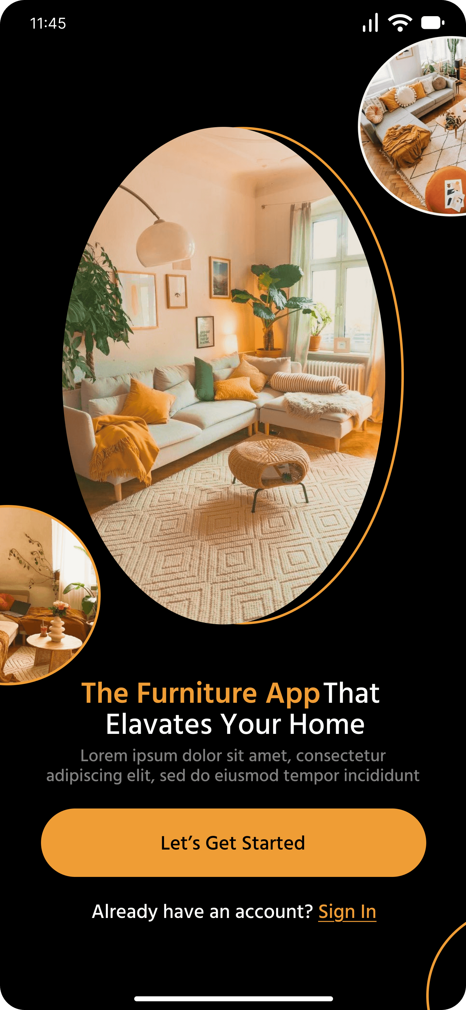
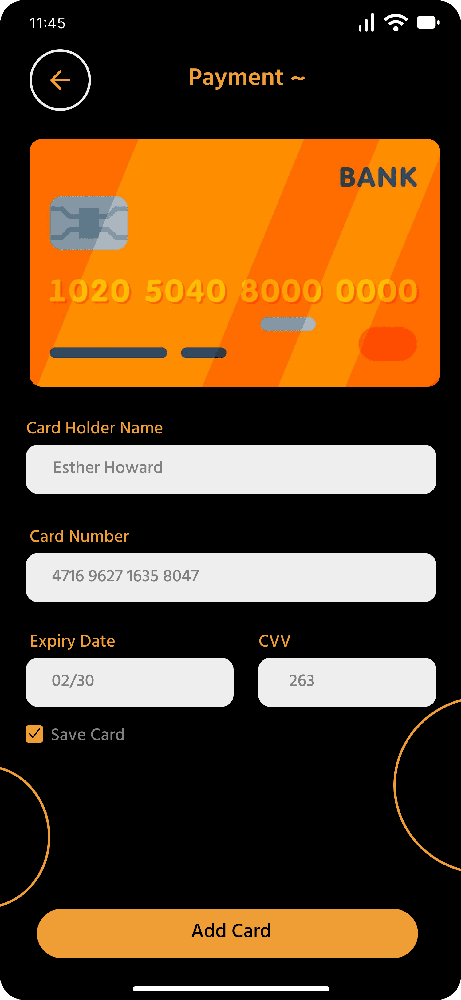
Each screen is thoughtfully designed to guide the user from discovery to purchase with visual clarity and warmth.
Each screen is thoughtfully designed to guide the user from discovery to purchase with visual clarity and warmth.
Final UIs
Final UIs
Quora ProAudio
Dome ProAudio brings powerful bass and crisp highs for a truly immersive experience. Precision-tuned for audiophiles who demand more.
Available in light blue.
Hear every detail
Quora ProAudio
Dome ProAudio brings powerful bass and crisp highs for a truly immersive experience. Precision-tuned for audiophiles who demand more.
Available in light blue.

Primary Palette
FurniEase uses a grounded, warm palette to strike a balance between function, aesthetic clarity & emotional trust—essential for an e-commerce furniture experience.
Orange | #FF8800
Used for buttons, icons, highlights & star ratings. This bold shade creates strong visual hierarchy and action cues. It adds warmth, draws attention to CTAs & reinforces brand identity.
Black | #000000
Used for body background and typography. Creates maximum contrast and focuses attention on core UI elements. Its neutrality pairs well with warm accent colors.
Primary Palette
FurniEase uses a grounded, warm palette to strike a balance between function, aesthetic clarity & emotional trust—essential for an e-commerce furniture experience.
Orange | #FF8800
Used for buttons, icons, highlights & star ratings. This bold shade creates strong visual hierarchy and action cues. It adds warmth, draws attention to CTAs & reinforces brand identity.
Black | #000000
Used for body background and typography. Creates maximum contrast and focuses attention on core UI elements. Its neutrality pairs well with warm accent colors.
Primary Palette
FurniEase uses a grounded, warm palette to strike a balance between function, aesthetic clarity & emotional trust—essential for an e-commerce furniture experience.
Orange | #FF8800
Used for buttons, icons, highlights & star ratings. This bold shade creates strong visual hierarchy and action cues. It adds warmth, draws attention to CTAs & reinforces brand identity.
Black | #000000
Used for body background and typography. Creates maximum contrast and focuses attention on core UI elements. Its neutrality pairs well with warm accent colors.
Primary Palette
FurniEase uses a grounded, warm palette to strike a balance between function, aesthetic clarity & emotional trust—essential for an e-commerce furniture experience.
Orange | #FF8800
Used for buttons, icons, highlights & star ratings. This bold shade creates strong visual hierarchy and action cues. It adds warmth, draws attention to CTAs & reinforces brand identity.
Black | #000000
Used for body background and typography. Creates maximum contrast and focuses attention on core UI elements. Its neutrality pairs well with warm accent colors.
Primary Palette
FurniEase uses a grounded, warm palette to strike a balance between function, aesthetic clarity & emotional trust—essential for an e-commerce furniture experience.
Orange | #FF8800
Used for buttons, icons, highlights & star ratings. This bold shade creates strong visual hierarchy and action cues. It adds warmth, draws attention to CTAs & reinforces brand identity.
Black | #000000
Used for body background and typography. Creates maximum contrast and focuses attention on core UI elements. Its neutrality pairs well with warm accent colors.
Primary Palette
FurniEase uses a grounded, warm palette to strike a balance between function, aesthetic clarity & emotional trust—essential for an e-commerce furniture experience.
Orange | #FF8800
Used for buttons, icons, highlights & star ratings. This bold shade creates strong visual hierarchy and action cues. It adds warmth, draws attention to CTAs & reinforces brand identity.
Black | #000000
Used for body background and typography. Creates maximum contrast and focuses attention on core UI elements. Its neutrality pairs well with warm accent colors.
Primary Palette
FurniEase uses a grounded, warm palette to strike a balance between function, aesthetic clarity & emotional trust—essential for an e-commerce furniture experience.
Orange | #FF8800
Used for buttons, icons, highlights & star ratings. This bold shade creates strong visual hierarchy and action cues. It adds warmth, draws attention to CTAs & reinforces brand identity.
Black | #000000
Used for body background and typography. Creates maximum contrast and focuses attention on core UI elements. Its neutrality pairs well with warm accent colors.
Primary Palette
FurniEase uses a grounded, warm palette to strike a balance between function, aesthetic clarity & emotional trust—essential for an e-commerce furniture experience.
Orange | #FF8800
Used for buttons, icons, highlights & star ratings. This bold shade creates strong visual hierarchy and action cues. It adds warmth, draws attention to CTAs & reinforces brand identity.
Black | #000000
Used for body background and typography. Creates maximum contrast and focuses attention on core UI elements. Its neutrality pairs well with warm accent colors.

Primary Palette
FurniEase uses a grounded, warm palette to strike a balance between function, aesthetic clarity & emotional trust—essential for an e-commerce furniture experience.
Orange | #FF8800
Used for buttons, icons, highlights & star ratings. This bold shade creates strong visual hierarchy and action cues. It adds warmth, draws attention to CTAs & reinforces brand identity.
Black | #000000
Used for body background and typography. Creates maximum contrast and focuses attention on core UI elements. Its neutrality pairs well with warm accent colors.
Primary Palette
FurniEase uses a grounded, warm palette to strike a balance between function, aesthetic clarity & emotional trust—essential for an e-commerce furniture experience.
Orange | #FF8800
Used for buttons, icons, highlights & star ratings. This bold shade creates strong visual hierarchy and action cues. It adds warmth, draws attention to CTAs & reinforces brand identity.
Black | #000000
Used for body background and typography. Creates maximum contrast and focuses attention on core UI elements. Its neutrality pairs well with warm accent colors.
Primary Palette
FurniEase uses a grounded, warm palette to strike a balance between function, aesthetic clarity & emotional trust—essential for an e-commerce furniture experience.
Orange | #FF8800
Used for buttons, icons, highlights & star ratings. This bold shade creates strong visual hierarchy and action cues. It adds warmth, draws attention to CTAs & reinforces brand identity.
Black | #000000
Used for body background and typography. Creates maximum contrast and focuses attention on core UI elements. Its neutrality pairs well with warm accent colors.
Primary Palette
FurniEase uses a grounded, warm palette to strike a balance between function, aesthetic clarity & emotional trust—essential for an e-commerce furniture experience.
Orange | #FF8800
Used for buttons, icons, highlights & star ratings. This bold shade creates strong visual hierarchy and action cues. It adds warmth, draws attention to CTAs & reinforces brand identity.
Black | #000000
Used for body background and typography. Creates maximum contrast and focuses attention on core UI elements. Its neutrality pairs well with warm accent colors.
Primary Palette
FurniEase uses a grounded, warm palette to strike a balance between function, aesthetic clarity & emotional trust—essential for an e-commerce furniture experience.
Orange | #FF8800
Used for buttons, icons, highlights & star ratings. This bold shade creates strong visual hierarchy and action cues. It adds warmth, draws attention to CTAs & reinforces brand identity.
Black | #000000
Used for body background and typography. Creates maximum contrast and focuses attention on core UI elements. Its neutrality pairs well with warm accent colors.
Primary Palette
FurniEase uses a grounded, warm palette to strike a balance between function, aesthetic clarity & emotional trust—essential for an e-commerce furniture experience.
Orange | #FF8800
Used for buttons, icons, highlights & star ratings. This bold shade creates strong visual hierarchy and action cues. It adds warmth, draws attention to CTAs & reinforces brand identity.
Black | #000000
Used for body background and typography. Creates maximum contrast and focuses attention on core UI elements. Its neutrality pairs well with warm accent colors.
Primary Palette
FurniEase uses a grounded, warm palette to strike a balance between function, aesthetic clarity & emotional trust—essential for an e-commerce furniture experience.
Orange | #FF8800
Used for buttons, icons, highlights & star ratings. This bold shade creates strong visual hierarchy and action cues. It adds warmth, draws attention to CTAs & reinforces brand identity.
Black | #000000
Used for body background and typography. Creates maximum contrast and focuses attention on core UI elements. Its neutrality pairs well with warm accent colors.
Primary Palette
FurniEase uses a grounded, warm palette to strike a balance between function, aesthetic clarity & emotional trust—essential for an e-commerce furniture experience.
Orange | #FF8800
Used for buttons, icons, highlights & star ratings. This bold shade creates strong visual hierarchy and action cues. It adds warmth, draws attention to CTAs & reinforces brand identity.
Black | #000000
Used for body background and typography. Creates maximum contrast and focuses attention on core UI elements. Its neutrality pairs well with warm accent colors.
Tip:
Tip:
Click and interact — this is a live prototype
Click and interact — this is a live prototype
Prototype
Prototype
Design System
Design System
Color Palette
Color Palette
Primary Palette
Primary Palette
FurniEase uses a grounded, warm palette to strike a balance between function, aesthetic clarity & emotional trust—essential for an e-commerce furniture experience.
FurniEase uses a grounded, warm palette to strike a balance between function, aesthetic clarity & emotional trust—essential for an e-commerce furniture experience.
Orange | #FF8800
Orange | #FF8800
Used for buttons, icons, highlights & star ratings. This bold shade creates strong visual hierarchy and action cues. It adds warmth, draws attention to CTAs & reinforces brand identity.
Used for buttons, icons, highlights & star ratings. This bold shade creates strong visual hierarchy and action cues. It adds warmth, draws attention to CTAs & reinforces brand identity.
Black | #000000
Black | #000000
Used for body background and typography. Creates maximum contrast and focuses attention on core UI elements. Its neutrality pairs well with warm accent colors.
Used for body background and typography. Creates maximum contrast and focuses attention on core UI elements. Its neutrality pairs well with warm accent colors.

Secondary Palette
The neutrals offer calm, breathable contrast to the dominant orange, allowing content and visuals to shine without clutter. Together, this dual-tone system builds hierarchy, usability & an inviting atmosphere, making browsing & purchasing smoother.
Cream | #FFFBF0
A soft background tone used in input fields & subtle card elements. Helps reduce eye strain on dark mode & brings a premium, earthy tone to the app interface.
Grey | #808080
Used sparingly for secondary labels, disabled buttons, and less important text. This neutral tone communicates subtlety and downplays non-critical UI elements, maintaining focus on primary actions.
White | #FFFFFF
Primarily used for text on dark backgrounds, card highlights, and iconography. It acts as the main contrast agent, enhancing legibility and drawing attention to content in a dark UI.
Secondary Palette
The neutrals offer calm, breathable contrast to the dominant orange, allowing content and visuals to shine without clutter. Together, this dual-tone system builds hierarchy, usability & an inviting atmosphere, making browsing & purchasing smoother.
Cream | #FFFBF0
A soft background tone used in input fields & subtle card elements. Helps reduce eye strain on dark mode & brings a premium, earthy tone to the app interface.
Grey | #808080
Used sparingly for secondary labels, disabled buttons, and less important text. This neutral tone communicates subtlety and downplays non-critical UI elements, maintaining focus on primary actions.
White | #FFFFFF
Primarily used for text on dark backgrounds, card highlights, and iconography. It acts as the main contrast agent, enhancing legibility and drawing attention to content in a dark UI.

Typography
Typography
66 px
56 px
46 px
36 px
26 px
16 px
The quick brown fox jumps over the lazy dog
The quick brown fox jumps over the lazy dog
The quick brown fox jumps over the lazy dog
The quick brown fox jumps over the lazy dog
The quick brown fox jumps over the lazy dog
The quick brown fox jumps over the lazy dog
Icongography
Icongography
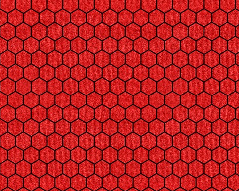
Outline
Outline
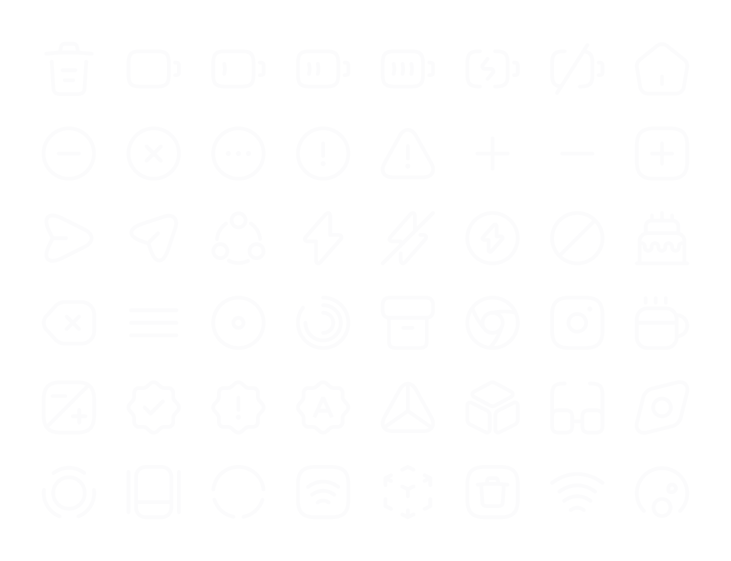
Bold
Bold

Takeaways
Takeaways
Not everything went as planned.
Not everything went as planned.
This project taught me the value of starting lean. Not all features I envisioned made it to the final prototype, but every compromise was intentional and helped prioritize the user’s core needs.
This project taught me the value of starting lean. Not all features I envisioned made it to the final prototype, but every compromise was intentional and helped prioritize the user’s core needs.


Design is less about pixels, more about people.
Design is less about pixels, more about people.
Working on FurniEase made me more empathetic toward users—especially when balancing aesthetics with clarity. I learned to simplify flows, make faster design decisions, and trust real user feedback over personal preferences.
Working on FurniEase made me more empathetic toward users—especially when balancing aesthetics with clarity. I learned to simplify flows, make faster design decisions, and trust real user feedback over personal preferences.
Reflections & Learning
Reflections & Learning


From smooth onboarding to visual cues in AR previews, every micro-interaction shaped a sense of comfort and trust. Good design isn’t loud—it’s quietly confident.
From smooth onboarding to visual cues in AR previews, every micro-interaction shaped a sense of comfort and trust. Good design isn’t loud—it’s quietly confident.
Conclusions
Conclusions


There’s always room to refine.
There’s always room to refine.
Given more time, I’d polish micro-interactions, strengthen accessibility, and explore voice search and smart suggestions for quicker browsing and filtering.
Given more time, I’d polish micro-interactions, strengthen accessibility, and explore voice search and smart suggestions for quicker browsing and filtering.
Scope of Improvements
Scope of Improvements


Your feedback helps me grow.
Your feedback helps me grow.
I’m always open to new perspectives. Got thoughts on this case study? Feel free to connect—I’d love to hear how it could be improved!
I’m always open to new perspectives. Got thoughts on this case study? Feel free to connect—I’d love to hear how it could be improved!
Got any Suggestions?
Got any Suggestions?
